
Loan Service Platform
Customer case managers were responsible for servicing complex loan accounts in a high-regulation environment, often while handling live customer calls. The existing tools exposed large volumes of financial data balances, transactions, fees, promotions, reversals.
The challenge wasn’t lack of data. It was cognitive overload, unclear hierarchy, and interaction patterns that slowed decision-making in moments where accuracy and speed were critical.
🎛️ The mechanics behind loan servicing
Customer case managers are the front line of the business. They take calls, resolve issues, explain balances, reverse transactions, set expectations, and make decisions that directly affect a client’s financial reality. The platform had to support that responsibility without slowing them down.
From the beginning, the challenge wasn’t just displaying information. It was helping people understand it fast, confidently, and without error.
This product sits at the intersection of finance, compliance, and customer service. Every number has a reason. Every status has consequences. A single action can trigger downstream effects across billing, accounting, and reporting.
That reality shaped every design decision.
Understanding the business before touching the UI
Before designing interfaces, I had to deeply understand the terms, values, and mechanics behind them. Concepts like principal, interest, fees, reserves, promo balances, bust dates, reversals, accrual methods, and payment application rules aren’t just labels from they’re business logic.
A balance is never “just a balance.”
A payment is never “just a payment.”
Each variable exists because of a rule, a policy, or a regulatory requirement. Missing that context would lead to dangerous oversimplification.
This understanding was built through frequent working sessions with the Product Director and the Information Architecture team. Together, we reviewed flows, validated terminology, and pressure-tested edge cases until every interaction was intentional and defensible.
This collaboration ensured the UI reflected the mental model of the business, not just visual consistency.
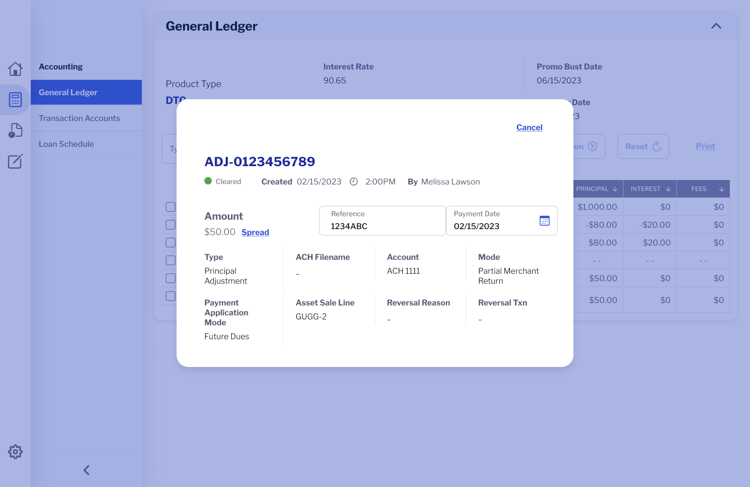
Transaction detail modal within the General Ledger view of a loan servicing platform.
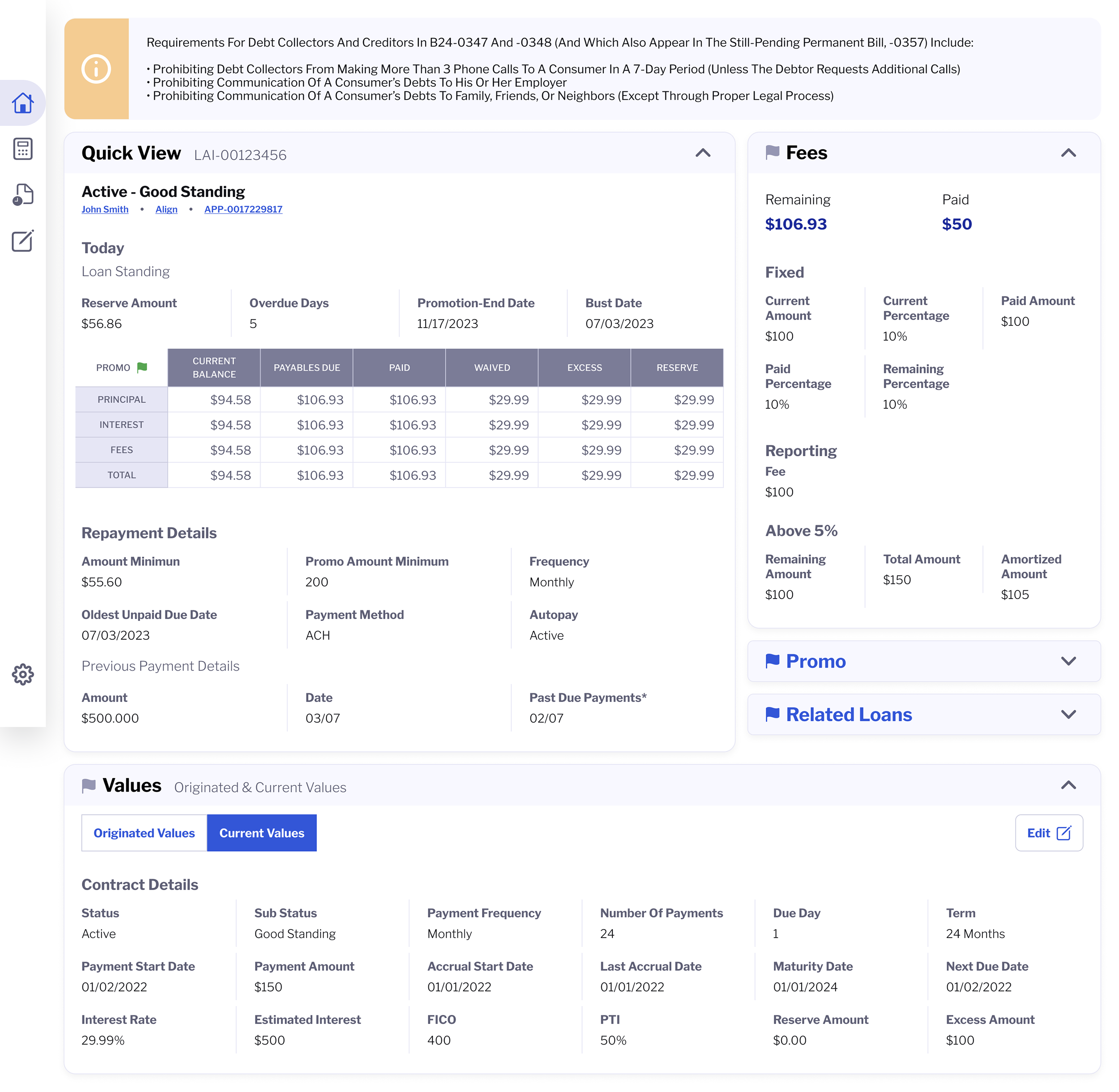
Designing for heavy data without overwhelming the user
Case managers don’t explore data, hey scan it. They jump between sections while on live calls, often under time pressure.
The interface had to surface what mattered now while keeping deeper detail instantly accessible.
The solution was a modular layout built around collapsible sections and clear active states. Information could expand when needed and collapse when not, allowing the screen to breathe without hiding power.
Visual hierarchy did most of the work: grouping related values, separating “current state” from “historical context,” and using consistent patterns so the eye could move quickly without relearning the interface each time.
The goal wasn’t minimalism. It was controlled density.
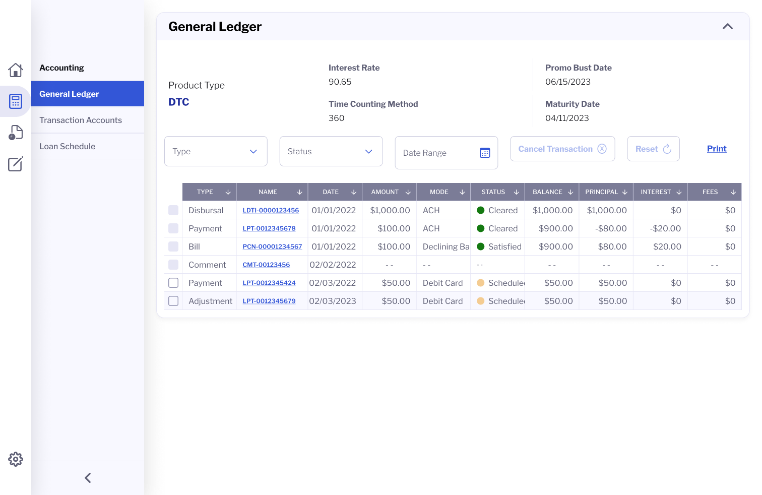
Tables as a primary interaction surface
Tables are the backbone of this platform. Payments, adjustments, disbursements, reversals, comments.; Nearly every critical action lives inside a table.
But standard tables weren’t enough.
They needed to support sorting, filtering, inline editing, expandable rows, status signaling, and real-time feedback without breaking structure or readability. Rows had to scale across different data types while remaining predictable.
We designed tables that could compress complexity without losing meaning. Collapsible rows allowed large datasets to stay manageable. Inline editing reduced context switching. Clear success and focus states made system feedback visible without interrupting the workflow.
Editing complex systems without breaking trust
Saving data in a financial system is a big deal. The platform needed to clearly communicate what is being edited, what is pending, and what has been committed.
We explored nested edit states for complex objects, deciding carefully when to allow inline edits versus when a dedicated form was necessary. Grids were used where comparison mattered. Lists were used where sequence mattered.
The interface always made state visible. Nothing happened silently. Every change acknowledged the weight of the action.
A design system built for servicing
The visual foundation leveraged Bootstrap and Material Design for consistency and scalability, while aligning with the existing website pattern system for typography, buttons, and inputs.
However, most components especially tables, status indicators, and data modules were custom designed.
This system was designed to grow. New variables, new rules, and new workflows could be introduced without breaking the mental model case managers rely on.
Outcome
The platform enabled case managers to resolve issues faster, explain financial information more confidently, and take action without losing context. Complex loan data became scannable, understandable, and trustworthy in live service scenarios.